ARTIST INTERVIEW: ALICE ZONG
Alice Zong is a San Francisco based, award-winning visual designer who focuses on graphic design, digital design, branding, typography, UI/UX, web and app design. We spoke to Alice about her personal projects, and she shares her experiences working for major fashion brands and Apple Inc.
Thank you for taking the time out of your day to talk with us, Alice. We're looking forward to finding out more about you and your creative practice.
“Designers work in a continually changing field. The finish line is always moving, and we will need to continuously develop and improve.”
To kick things off, after you graduated from design school, what your first graphic design job, and how did you get it?
After graduated with my Master's Degree in Arts at Rochester Institute of Technology, I moved to New York City and started a new life there. Like every new graphic design graduate, I am passionate about design and made efforts to support creative concepts. My dream was to become a professional graphic designer and work at a creative agency in NYC.
My very first graphic design job was at the creative branding agency ThoughtMatter. It’s a creative agency that designs, researches, develops, strategizes, and creates systems for expressing stories more effectively. Their clients and partners are driving change across diverse sectors, from arts and culture to health and economic development. They have also photographed rock concerts, written for major news outlets, organized architecture festivals, and immersed themselves into multiple aspects of the city culture of New York.
The first time I saw the ThoughtMatter website and their projects, I was immediately attracted by their designs and concepts. During the interview process, I had the privilege to talk with Mr. Tom Jaffe, the chief executive. Mr. Jaffe himself was a leading business journalist who reported on management while acquiring and managing a significant art collection. Mr. Jaffe is a Yale University Alumnus and I was very impressed by his “Yale University Art Gallery App Case Study.” That was a great interview, and it was the start of my visual designer career. I am so grateful for the many ways I have grown as a graphic designer through this opportunity, and I still keep in touch with Mr. Jaffe and other designers at ThoughtMatter.

© Alice Zong
“Working at Apple is such an exciting and challenging experience”
You currently work as a visual designer with Apple Inc, can you tell us about one of your recent projects and how you landed the role?
I was recruited to work at Apple Inc. as a senior graphic designer, and I love the culture and design of Apple. All of the design team members are extremely talented and amazing to work with. Working at Apple is such an exciting and challenging experience, and we have the chance to work with top editors, writers, photographers, and video editors. We also get commissioned to work on projects with illustrators and artists all over the world with some of the most exciting illustration and design projects.
As a visual designer with Apple Inc, one of our significant projects that I recently worked on is the Disney+ design for Apple Store Today tab design. Disney+ will be the ultimate streaming destination for movies and shows from Disney, Pixar, Marvel, Star Wars, National Geographic, and more. From The Walt Disney Company’s Direct-to-Consumer and International segment, Disney+ will offer ad-free programming with a variety of original feature-length films, documentaries, live-action, and animated series and short-form content, along with unprecedented access to Disney’s incredible library of film and television entertainment. Having experience with several iconic companies, I learned to work in a very systematic and diligent manner as an independent thinker within a team oriented corporate culture, a faster learner in a deadline-driven environment, and a dependable team-player. This position has been the most challenging, stimulating, and rewarding yet. It was a privilege to work as the design DRI (Designated Radiation Isolation) of the Disney+ project, and it was an excellent fit since I had direct experience with very similar projects.
© Alice Zong
“ It can, in the long run, bring a great sense of accomplishment with the enriching feeling of having really made a meaningful contribution to mankind and its betterment.”
Your career has given you the opportunity to work with iconic companies including J.P Morgan Chase & Co., L'Oreal Group (New York) Tom Ford, Ralph Lauren, Ann Taylor and Gap Inc. Working with such high-profile clients comes with significant demands and challenges. As an international visual designer, what's the biggest challenge you have faced in your career, and how did you overcome it?
Embarking on the journey of being a professional designer at those iconic companies takes tremendous courage, given the realities of the multiple challenges facing an international designer. As good design is not always measurable, it is not easy for me to prove myself as a designer, and there will be many more obstacles along the way.
The most challenging moments of my career was when I had to balance between an art/design integrity and a commercial solution of a design project. Compromising the design might lead to signing a project that is substandard by my measure. To face the challenge, I will have to learn strategic thinking as managing clients and people’s expectations, in general, as a crafty skill that requires patience and long-term views as well as embracing the needs and perspectives of the clients and other interested parties involved. It takes resolve and confidence during the process to voice the standards that I believe in and make every effort to uphold.
It’s like a Zen story, and the gist of it is that the path needs lots of strength and patience. If you are looking for immediate satisfaction, it might not be the best path for you. But it can, in the long run, bring a great sense of accomplishment with the enriching feeling of having really made a meaningful contribution to mankind and its betterment.
“One should not only include the best projects at the moment, but also be mindful of the future plan of that design.”

© Alice Zong
What advice would you have for a designer/illustrator looking to enter the fashion/beauty industries? Are there any particular do's and don'ts for portfolio presentation and what to include? How would you best recommend getting your foot in the door?
As a graphic/visual designer with experience in the fashion and beauty industries, one thing that I always keep in mind is to always keep a fresh eye and vision of the continually changing world and creative field. When preparing for the portfolio presentation, one should not only include the best projects at the moment, but also be mindful of the future plan of that design.
Keep practising, always get inspired, and continue contemplating about the future of design. It is such a great experience to express our creativity as designers. Good design makes our futures so much better. Designers work in a continually changing field. The finish line is always moving, and we will need to continuously develop and improve.
“It’s such an amazing experience to work with a large collaborative group under the direction and leadership of a talented design professor.”
Do you have a favourite project that you have worked on? If so, what is it, and why?
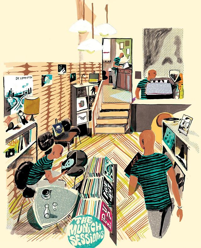
One of my favorite projects that I have worked on is my published book, "Human Health Book," which is featured in The Vignelli Center for Design Studies at Rochester Institute of Technology, and completed by a group of talented designers which made it such a great experience.
The MeDesign Human Health book is the result of a 10-week project in the Graduate Graphic Design Applications course in the MFA Graphic Design program in the School of Design at Rochester Institute of Technology. Thirteen first-year graduate students were presented with a challenge: design a book section (4 to 6 pages on a part of the human body), conduct research, write content, and design mostly non-verbal visual explanations through highly stylized graphics and diagrammatic components. Students collaborated in teams to design the book's structure and layout as well as develop a system of icons for each of the thirteen sections, design the cover, coordinate and prepare files for printing, and shepherd the project through its printing production.
This is my favorite project because it is my very first published book in school, and it means so much to me. I was honored to be one of the designer members of the group. It's such an amazing experience to work with a large collaborative group under the direction and leadership of a talented design professor. I learned about teamwork and was determined to surpass every difficulty during the design process. All of these experiences became extremely valuable in my career and have helped me with every single design project along the way.

© Alice Zong
“ I have always thought about my family, and I used their inspiration to make this design. ”
As well as working for large corporate clients, you also produce a considerable number of personal projects such as your Chinese Paper Cutting typeface which was published in Oriental Motifs in Modern Design by SendPoints Publishing Co.,Ltd.
We love the backstory to this project. Can you tell our audience about the inspiration for this project and where they can find out more about it?
I’d love to share the backstory of this Chinese Paper-Cutting Typeface design project.
The inspiration for “Chinese Paper-Cutting Typeface” comes from traditional Chinese paper-cutting where it combines the various style elements in traditional paper-cutting into the 26 letters of the English alphabet. The primary color of this set of subtitles is China red. The design incorporates the unique “freehand” charm of Chinese art.
The inspiration for this design also came from the love of my family. As a native Chinese, my father taught me the art of paper-cutting when I was very young. It is a tradition that Chinese people observe to celebrate the Chinese New Year. The red Chinese paper-cutting is a symbol of joy and happiness. When I was young, my parents and I would celebrate the Chinese New Year every year, and our celebrations always included Chinese paper-cutting. As I moved to the U.S. and became a professional designer, I have always thought about my family, and I used their inspiration to make this design. It will always help me remember my home and my roots.
The Chinese Paper-Cutting Typeface Design was selected and published in the book series, Oriental Motifs in Modern Design by SendPoints Publishing Co., Ltd. This comprehensive reference book examines the history and meanings of more than two dozen classic Chinese motifs while providing countless examples of contemporary applications. To give readers enlightenment and references in modern design, this book will present over 500 oriental motifs and showcase outstanding works that were inspired by them, aiming to provide readers an insight into traditional Asian culture.

© Alice Zong
Do you prefer working on personal projects or collaborating with a design team?
Although I work on design projects on my own most of the time, I also like to work in a synergistic team setting, and consider myself a reliable team player and love working with others who are also team players. My published book, "Human Health Book," which is featured in The Vignelli Center for Design Studies at Rochester Institute of Technology, was completed by a group of designers. It was a great experience working on a team full of talented designers.

© Alice Zong
“ I also consider the future of design and the factors that drive the industry, such as technology and innovation.”
Your work is highly conceptual. What is your ideation process for developing the concepts for your projects?
My design usually starts from pure inspiration and develops to several more complex ideas. I will then research the target audience for the project. After creating several draft ideas, I will focus on each possibility and continue working on the development until the final product. After one project is completed, I will usually conduct a customer survey to get feedback from my target audience.
Being a designer in the industry for more than 7 years, I have formed my own design style, however, I will keep an open mind and I am always checking and learning the current trends in the trade as I always get inspired by awesome designs from time to time. I also consider the future of design and the factors that drive the industry, such as technology and innovation.

© Alice Zong
“The bright red allows the audience to feel the rich Chinese elements in the works at first glance.”
You recently won the 2019 A' Design Award & Competition. Can you tell me about The Chinese paper cutting Typeface work that you entered?
It was inspired by Chinese traditional paper cutting. The most unique aspect of this Chinese paper-cutting Typeface design is the idea to mix the very traditional Chinese patterns and elements into the 26 letters of the English alphabet. It’s a fusion of my culture and roots with my professional experience. As a Chinese designer, I am always thinking about my cultural background, yet I also love to apply my expertise here and work and live here in the U.S.
The project includes 26 letters of Typeface design and a book with each letter with the explanation of each exquisite Chinese traditional element pattern, each of which is hand-made and hand-drawn in Illustrator. Each kind of element with the delicate Chinese impressionistic style is integrated into the 26 English letters. Decorated with Chinese elements, the letters show exquisite elegance and luxuriant cultural implications of China.
Initially, a large number of materials related to traditional Chinese patterns were collected, including traditional auspicious clouds, back-grain patterns, and lotus patterns. At the same time, I personally hand-painted and imported for digital painting correction, and combined them with the twenty-six English letters according to the image as well as the intent of each pattern. The collection of materials takes time and energy, but it is also the most exciting part of the whole work process. Through this session, I also learned much more about traditional Chinese patterns and found many interesting subtle illusions. I chose the unique “China Red” as the primary color of the whole set of fonts. The bright red allows the audience to feel the rich Chinese elements in the works at first glance.

© Alice Zong
“The art show also aims to enrich the diversity of urban arts and bring various cultural experience to the attendees.”
You have been invited to feature your work in some of the big exhibitions in New York and Europe, can you talk us through your experience of preparing for the exhibitions?
It’s always a great exhilarating experience preparing for the exhibitions with the various concepts and planning. Each exhibition is so different yet all very exciting.
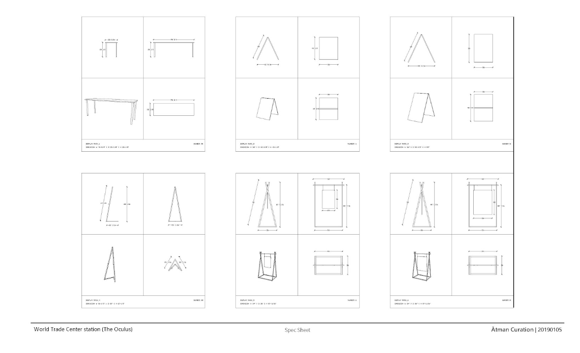
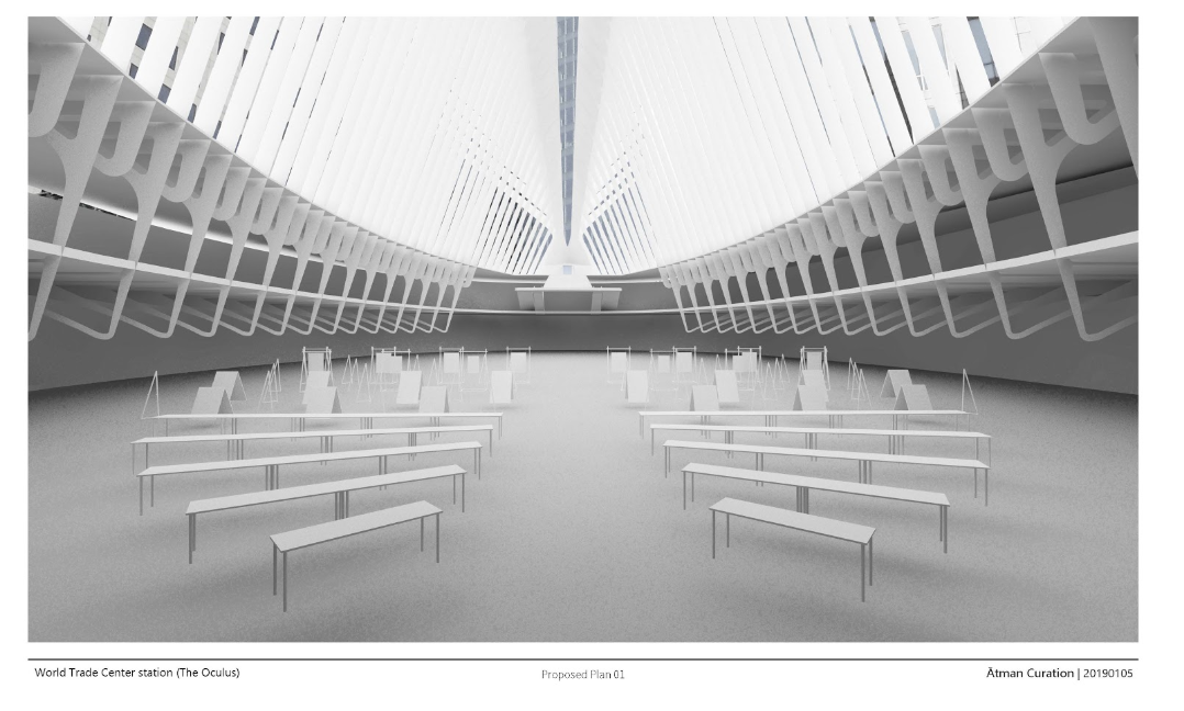
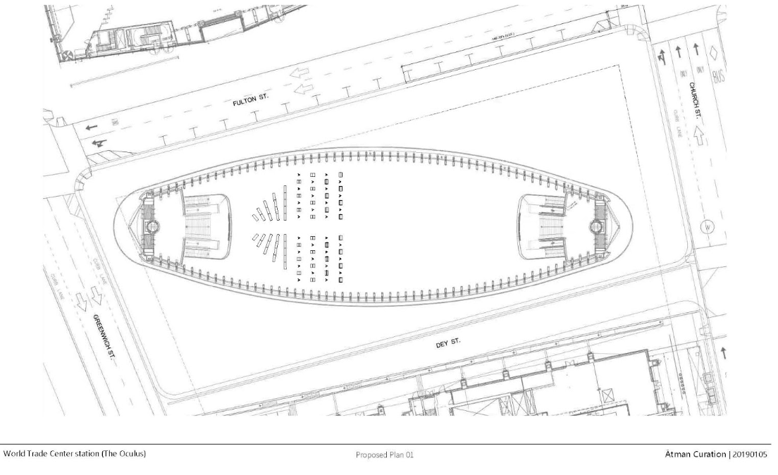
In 2018, I attended The Oculus Art Exhibition at The World Trade Center, NYC, which was organized and sponsored by the Asian Cultural Center and Atman Curation. The World Trade Center and the surrounding area is a landmark of the U.S., a landing place for immigrants, as well as a modern space for innovation. The art show also aims to enrich the diversity of urban arts and bring various cultural experience to the attendees.
The organizer was very professional, and they started with a proposal for the “exhibition blueprint” of the space, including all the exhibition stands and the layout to make the event as convenient as possible for everyone involved, including the exhibitors as well as the visitors. Besides preparing for my own exhibition stand, I marked the position of my stand to a highly visible location and made sure the printed artwork is perfectly decorated when displayed. It was also great to exchange experiences with other designers in the exhibition show. Each event is a fantastic experience for me, and I am looking forward to my upcoming exhibitions.
© Alice Zong
“As a graphic/visual designer, one of my most important goals is to visualize information and make it presentable and easy for people to understand.
”
Today, there is considerable pressure for designers to develop more environmentally sustainable practices. What are some of the sustainable practices you implement in your work as a designer?
One of my award-winning projects, “Marine Food Chain Infographic Design,” was a part of the sustainable practices I implemented in my work as a graphic/visual designer. It was part of my Information Graphic practice in graduate school. As a graphic/visual designer, one of my most important goals is to visualize information and make it presentable and easy for people to understand.
Design-related decisions are happening everywhere daily, impacting “sustainable development” or provisioning for the needs of future generations. Global sustainability and design are intimately linked. Quite simply, our future is designed. A great designer should always think about the future of design. Even though sustainable graphic design is a smaller subsection of overall sustainable design, I am quite glad that as designers, we are able to contribute with our work of art and raise awareness through our visual designs. We are all looking forward to the great future of design.


© Alice Zong
What are your top five destinations you would recommend for a designer visiting San Francisco?
SF Art Book Fair (Once a year)
What are three online resources every designer should know?
I would recommend Designspiration.com as it’s one of my favorite go-to sites for brainstorming and inspiration. There are tons of amazing projects shared by talented designers and artists. It has incredible layout and editorial designs that are stunning. Tons of great inspirational ideas can be acquired from posters, signs, and general artwork.
I also love Behance. I have a Behance profile, and anyone can join and post on the site. This gives Behance a more significant archive of artwork compared to sites like Dribbble. The large categorized assortment of artwork makes finding specific design inspiration much more accessible.
The other site that I always go to, not surprisingly, is Pinterest, my immediate first choice. While you can just go to the search bar and type in “newspaper design,” I’ve found that following different news design or editorial design boards on Pinterest surfaces new images and ideas on your homepage without any effort. So two months later, when you’re looking for an original muffin recipe on Pinterest, you might stumble across a fantastic design that happens to fit your needs perfectly that was published in an article which was just submitted earlier that day.

© Alice Zong
“Good designs make our future life so much better”
Can you share your plans for the future - what can we look forward to seeing from you in 2020?
Good designs make our future life so much better. However, being a designer will work in a continually changing field, and since the finish line is always moving, we will need to continually learn and improve. One of my work-in-progress now is a branding project extension of my Chinese Paper-cutting typeface. The Chinese paper-cutting Typeface design is a starting point, and there will be potential for more related visual design such as branding design, advertising design, and posters.
I am looking forward to sharing more related designs in 2020.
Thank you for your time today Alice!

© Alice Zong