JASON CARNE IS A SELF TAUGHT LETTERING ARTIST AND TYPE DESIGNER, WORKING IN KENTUCKY. JASON SPOKE TO US ABOUT DEVELOPING HIS AESTHETIC STYLE AND OFFERS ADVICE TO ARTISTS SEEKING AGENCY REPRESENTATION
Hello Jason,
Firstly, thank you very much for taking the time out of your day to answer our questions. We’re looking forward to finding out more about your practice, and of course we are thrilled to be publishing your artwork in Ascenders Volume. 1, Leaders in Contemporary Lettering.
You’re welcome, and likewise, I’m really looking forward to the book and I appreciate you having me included, thank you!
Can you tell us about how your relationship with art began, and what about typography appealed to you?
Art was something that was just in me from birth, from kindergarten onward I was always the class artist, I’m pretty sure that was even my high-school superlative. Typography and lettering was something I never even considered, it simply didn’t register to me as something you could do for a living, even though all through high school I spent more time drawing heavy-metal band logos than I did taking notes. I think what appealed to me with typography before I even KNEW it was typography was that it communicated a feeling without spelling it out. Those metal band logos are what planted that seed in me. The chromed-out, angular type of bands like Metallica, Anthrax, and Megadeth told me they were going to be a fast-paced thrash metal band. An old-english, all caps typeface in black and white meant that bands like Gorgoroth or Bathory were going to be some raw, primal black metal stuff. That ability to convey a sound, emotion, or message through lettering style really fascinated me and eventually became more interesting to me that the other components of the artwork I was creating.

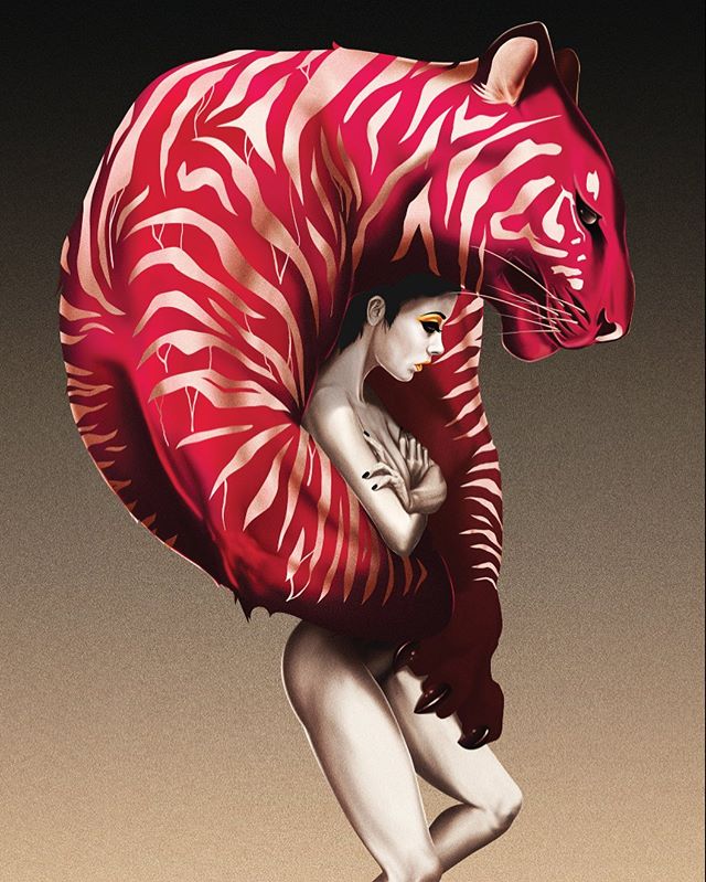
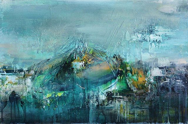
© Jason Carne
You’re a self taught artist, how did you go about honing your craft and developing your own graphic / illustrative aesthetic?
This is going to sound like an oversimplification, but it’s really just a ton of practice and repetition. There’s no silver bullet that gets you from novice to expert, you have to put the time in and be dedicated to your craft (or any craft) to become exceptional at it. I studied alphabets, copied them, traced them, and eventually gathered a fairly solid understanding of some rudimentary letter styles like Roman, block, blackletter, etc. Once I had those down I started customizing my letters and stylizing them bit by bit until all I drew were my own letters and I no longer relied on the alphabets I started with. Today my lettering is rooted in the history of alphabets and a basis of proper proportion and form, but still completely my own.
Where do you look to for inspiration for your work? Which artists are you currently enjoying?
Inspiration is curiously something I find I need less and less of lately, maybe because of my Lettering Library project, or just because I’ve scrolled through endless feeds from people like the Type Hunter, but I feel like I have so much information jammed into my brain now on lettering and layout that I just don’t go digging for it purposefully very often anymore unless I’m trying to reference a very specific style of era. That being said there are still some artists I follow and I wonder “how did they do that?!” - Dave Smith, Aaron Horkey, Chad Michael, Dan Gretta, Kevin Cantrell, Skyler Chubak, Louise Fili, Ken Barber, Ed Benguiat...those are the big ones coming to mind right now. If we dig further back into the history books (literally), there are few lettering artists from a century ago who still blow my mind like Daniel T. Ames, P. W. Costello, E. C. Matthews, Ross F. George, and Rand Holub.
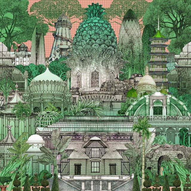
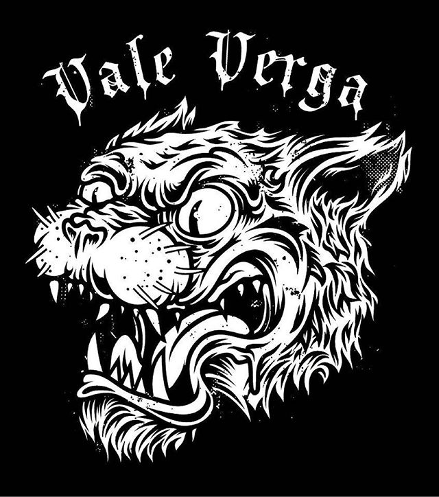
© Jason Carne
You live and work in Kentucky and your portfolio has a distinctly Southern / Americana aesthetic. How does your environment influence your art?
When I was reading this question I thought to myself “does it really?” - and I have to say, I kind of agree. I don’t think this happened consciously, but working at an ad agency that creates content for the Lexington tourism agency and for some major players in the bourbon scene here has probably rubbed off on me more than I’ve realized.
Food, art, music (and derby!) is an integral aspect of Kentucky culture. What are your three must-go destinations for anyone travelling in Kentucky?
All very true, we have some really great food here and my favorite spot in town has to be Malone’s - a real Kentucky steakhouse with the best cuts I’ve ever had. The art scene is really cooler than you’d expect here too, but bourbon is really where it’s at - we have tons of distilleries from some of the worlds biggest brands, and they’re practically all neighbors. The cream of the crop of the crop though has to be Buffalo Trace Distillery, it’s old as hell, has a killer tour, and bottles some of my personal favorite brands like Weller and Eagle Rare. The music and derby scene in Kentucky isn’t really my speed, I’m more of a lowbrow heavy-metal & punk kind of guy - frilly hats and bluegrass don’t do much for me. However, one of my all time favorite record stores is here which always has some killer used vinyl and a solid selection of newer stuff too, they’re called Pops Resale - I go every Friday on my lunch break when they restock the bins.

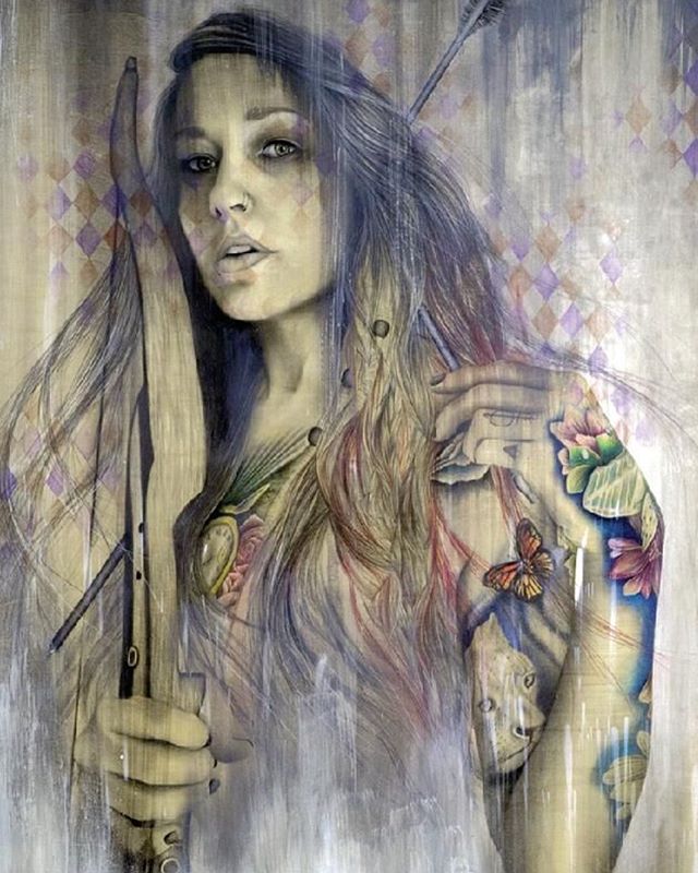
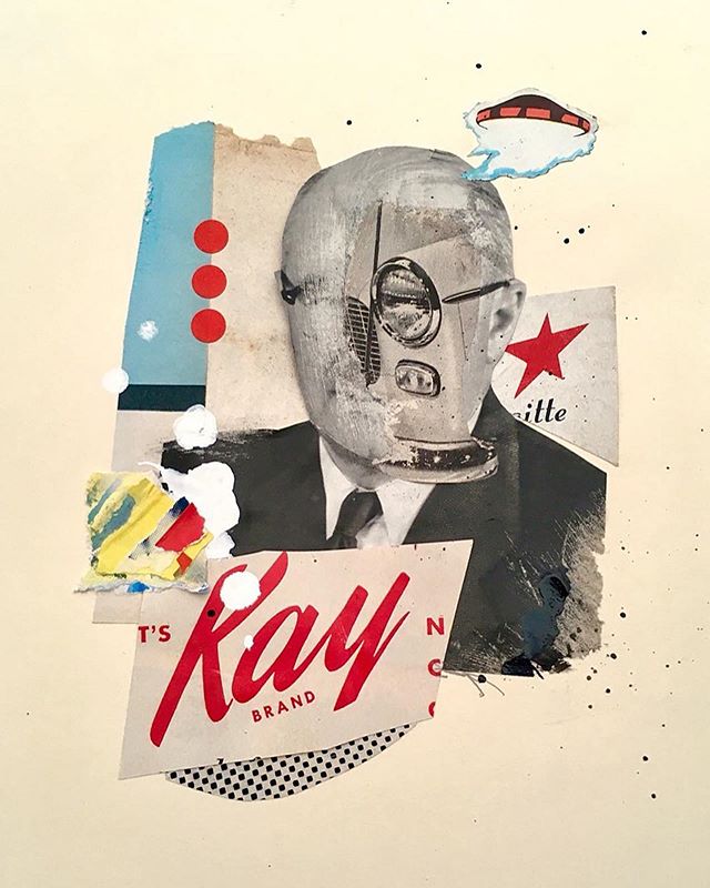
© Jason Carne
Could you tell us about your creative process, do you work purely digitally or is it a mix of analogue and digital techniques?
My process has changed over the years to be more digital than analog, which the old me would’ve hated, but the new me finds more efficient. I still pride myself on doing things 100% custom and that used to mean doing everything by hand, but as I’ve gotten better in Adobe Illustrator over the years, I’m spending more time in the vector machine than at my drawing table. Everything still starts with a sketch, pencil and paper always has and always will be my go-to for concepting - I just don’t need to polish them as much as I used to before digitizing my work.
Your work is represented by illustration agency, Closer&Closer. How did that relationship happen, and do you have any advice for artists seeking professional representation?
Closer&Closer was started by a good friend of mine named Drew Melton, who also just so happens to be my former business partner whom I opened Carmel Type Co. with a few years back. I think it was just a combination of fortune and fate that brought us back together and it’s been a mutually beneficial relationship thus far that I don’t see ending anytime soon. Being that I had an inside man at Closer&Closer it was probably easier than to usual to acquire representation, but one piece of advice I’d impart on anyone seeking representation is to either apply to places that have a style that suits your skillset.
You’ve worked with some very impressive names on a range of projects, what is your career highlight so far?
This is a tough one, and I’m going to say it’s a toss up between doing t-shirt design for Harley-Davidson and Wu-Tang Clan. I’ve been obsessed with motorcycles, biker/outlaw culture, and all things loud and fast my whole life, so working on a ton of pieces for Harley-Davidson was a real high point for me. However, doing some work for the most legendary hip-hop crew ever is right up there too (Ghostface is the best member by the way, you won’t sway me on this).

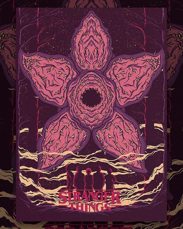
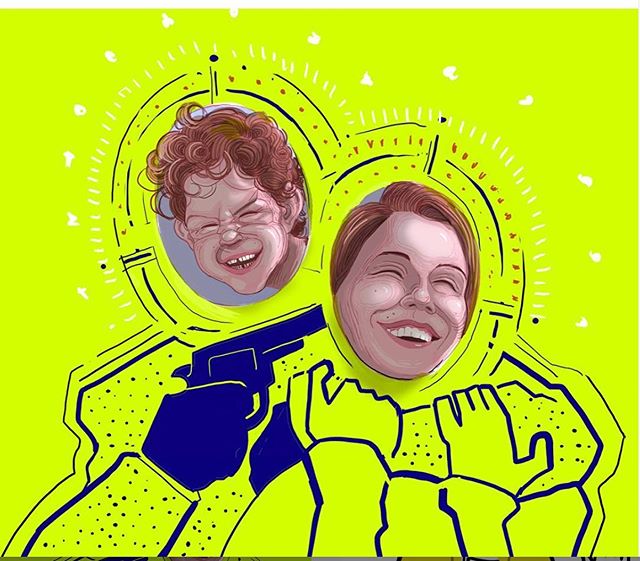
© Jason Carne
What do you enjoy doing in your down time, do you have any other creative outlets?
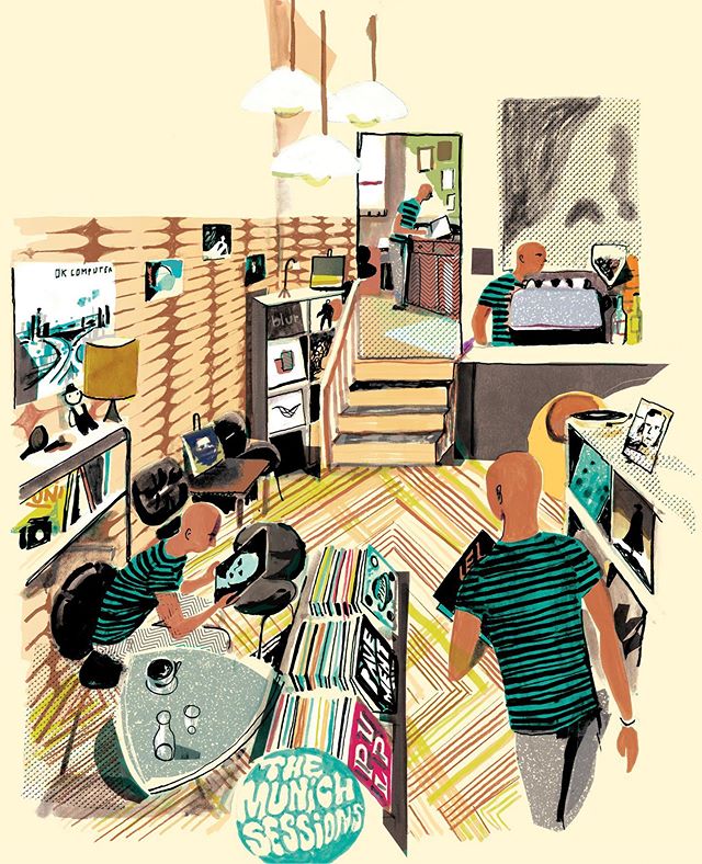
I’ve been collecting records for a few years now, and I try to sit down and listen to at least one record a night, usually with my wife Melissa. I collect everything, hip-hop, death metal, cool jazz, electronic, punk, ambient, hardcore, indie, whatever - so we have a ton of different options and moods. It’s a great way to get out of your own head for a bit just enjoy something tangible that can sonically transport you somewhere else or speak to you on a deeper level.
We’re excited to hear about what you’re up to next, can you share any details of projects are you working on?
I’m currently in the midst of rebranding a spirits company, and a root beer company, both of which are exciting projects which are fairly large departures from their current look. I also have something for Disney in the pipes which is always incredible, and tons of interesting smaller one-off gigs that keep my moving.